Source of article Barnes and Roberts Trial Consulting.
Document excerpts are a mainstay of litigation graphics so it is important that we get it right. In the 27 years that I’ve been in litigation graphics, I’ve seen a lot of well-designed excerpts, and a lot of poorly designed examples, too. Today I want to explore this particular type of graphic and pass on some design tips. First, I’ll point out some common design choices that, in my opinion, are bad. Thereafter, I’ll show a few examples of good excerpt design. So, let’s get started.
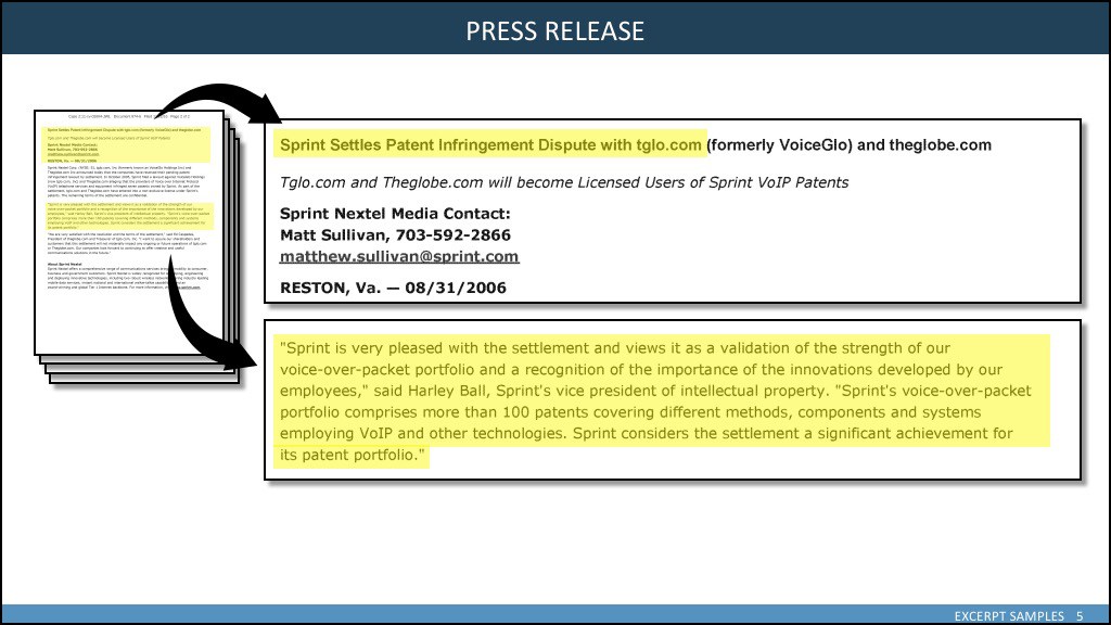
BAD EXAMPLE 1 – In the slide below, the design is distracting and obscures the actual information you are trying to convey. The bold black lines, the drop shadows everywhere, and the bold, swooping arrows are not helping. Instead, they are visual clutter drawing attention away from the content. The highlighting overlays and diminishes the contrast of the text below making it harder to read and less important to the eye. The title tells the viewer almost nothing. There is no citation to identify the document. In the second call-out, the whole of it is highlighted. When we highlight everything, we’ve highlighted nothing. Restraint in highlighting is important.
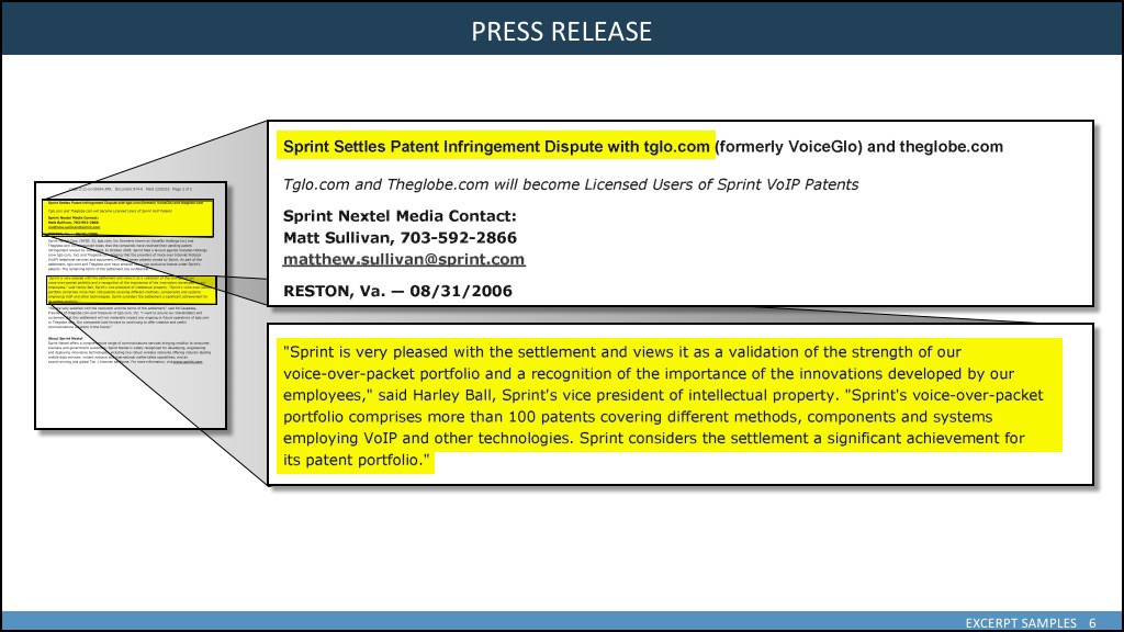
BAD EXAMPLE 2 – In the next example, the excerpt highlighting color is corrected, but we’ve traded in our arrows for tinted boxes to indicate the position of the excerpted text. Again, the graphic elements are distracting and diminish the impact of the excerpted text. There are instances where we would want to indicate the position of origin. For example a footnote or a single line in a long drug monograph. But, these instances are rare and should not form the basis of a typical design. The words are always important, the position rarely is.
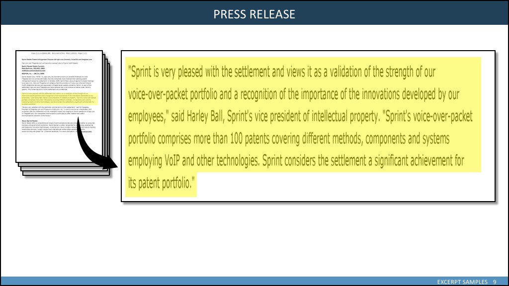
EXAMPLE 3 – We often see document experts that have been stretched and squeezed to “fill the slide.” This technique rarely improves the situation. If your text is too small or too low in quality, retyping might be the best solution. Here, again, we see the tinted overlay highlighting and the return of the swoopy arrow. This example, along with example 1, have multiple page icons to indicate that there is more than one page to the document. There may be times when you wish to demonstrate that a document has more than one page, but there are other ways to do that more effectively. For example, you might create a slide showing each page fanned out with some text indicated the total number of pages. Here it just makes a distractingly heavy element on the left when our content is on the right.
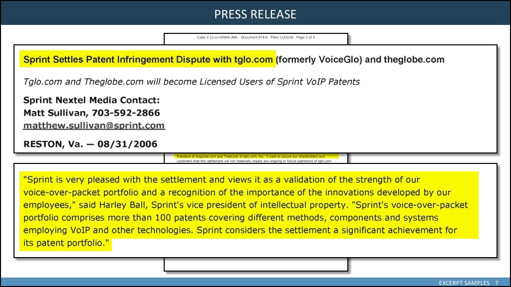
BAD EXAMPLE 4 – Clients often ask for the document image to be full size on the slide so the jury can read it. Unless it is animated, however, that design inevitably leads to something like the slide below where the excerpts complete cover the underlying document. In this case, we would ask ourselves why we included the full page at all. A point which must be made is that as soon as you decide to overlay the document with the excerpt, you absolutely have to include borders and shadows around your images to help the viewer understand the positional relationship of the original document and the two excerpts. However, each of these three elements share identical strokes and shadows which don’t look very natural. The underlying document should have a lighter, thinner stroke and a smaller shadow to help separate the layers.
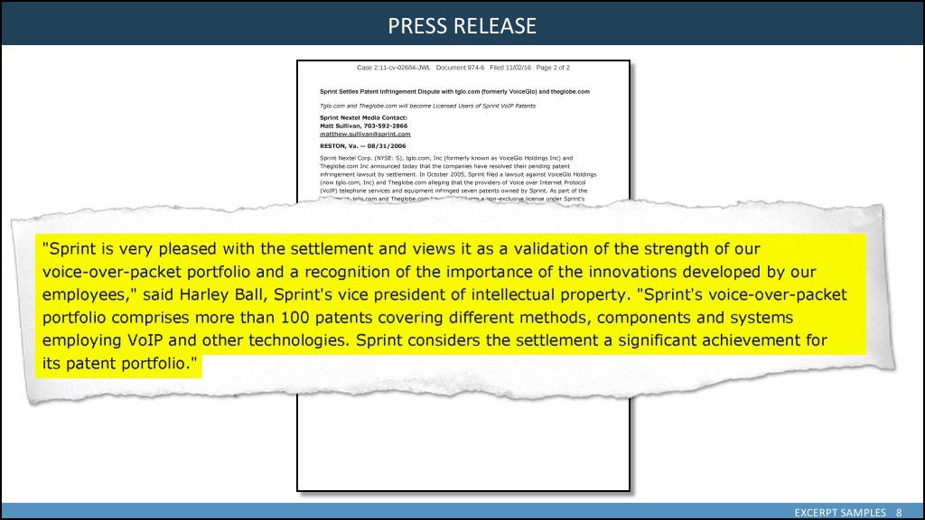
BAD EXAMPLE 5 – Unless your evidence is in the form of an old newspaper clipping, there is absolutely no reason to ever use the torn-edge-paper graphic on your slide. No reason. Ever. It takes up space, it distracts, and it simply is not realistic. Are you portraying the fact that you ripped up the document to produce this image? Of course not. Would you ever do that to a real document? Equally preposterous. So why do it on your slide? I see these on the news shows every now and then but, seriously, it’s bad. Please don’t do it.
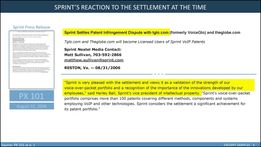
GOOD EXAMPLE 1 – Below we see an excerpt slide that attempts to fix the problems with the slides above, to be organized and structured, to be clear about its source and its content, and to eliminate all unnecessary graphic elements. First, we have a meaningful title. The title is important and ought not be wasted. We show only the front page of the document as it will be most easily recognized and is in most cases marked with the trial exhibit sticker. The page is a good mark of “authenticity” to give the jurors comfort that the expert really is from that document. But we don’ need to show each page. Since the page icon is on a white background, we separate it with a light stroke and small shadow. We identify the document with a colloquial description, words that we use all the time to describe the document. We also identify it as PX 101 so that everyone in the courtroom knows what we are talking about. It is a good reminder for the attorney to state the exhibit number of the excerpt for the record. We also add a date to help put the document in context. At the bottom left, we can provide additional cite information. Note that these descriptors are lightly colored so that although they are easily seen, they are not competing with the content of the excerpt itself. As for the excerpt, we simply let it lay on the white background with no stroke, no shadow. We separate the two callouts by a dividing line – subtle and not distracting but sufficient to separate the two elements. The highlighting is only on those portions of the excerpt that are the most important.
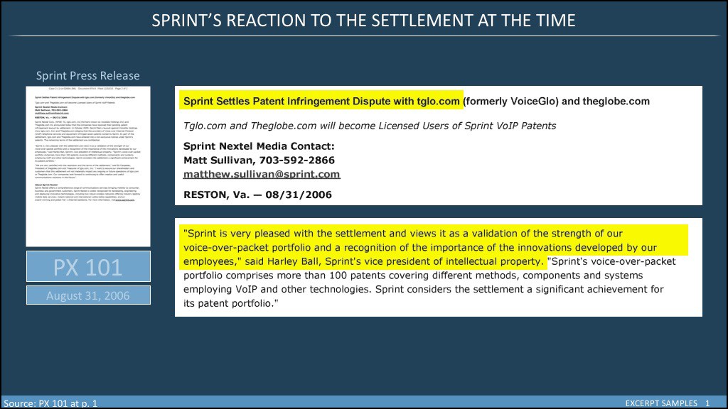
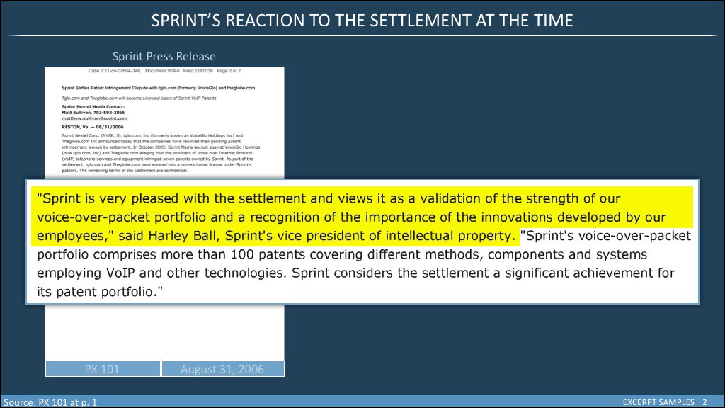
GOOD EXAMPLE 2 – Some people prefer a dark background. Here we’ve taken the slide above and converted it into a slide with a dark blue background. The excerpt text is slightly smaller because we’ve had to place it in the white box. Remember that all graphic elements will take up some room leaving less room for the content. On the other hand, the white boxes more clearly separate the two excerpts. Notice, however, that there are few strokes or borders, and no shadows of any kind as the high contrast between white and blue does the work for us.
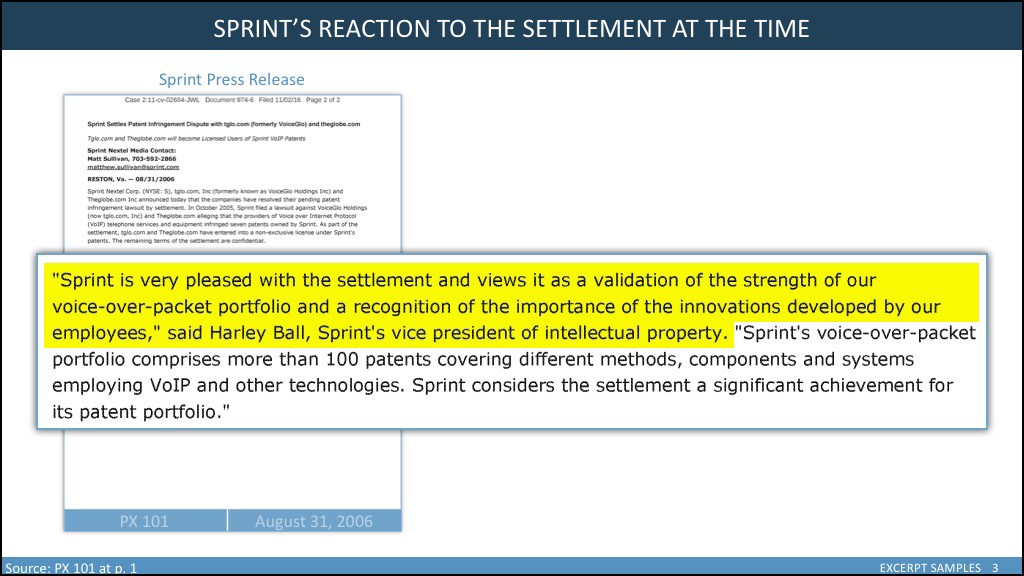
GOOD EXAMPLES 3 AND 4 – In the examples below, we’ve switched out our small page icon for a larger image. We can read the top lines (just barely) and can easily recognize the document. We’ve kept all the identifying information: description, exhibit number, and the date. Because we want both a large document icon and the best clarity we can get for our expert, we have filled the horizontal image are with the excerpt, leaving a little breathing room on either side. We are careful not to cover any important information on the large page icon. That means we may have to break up larger text blocks into two slides. In both instances, because we have overlapping elements, we have to use strokes and shadows. These use up room and can compete with the content for the user’s eye. So, we minimize them and make them just strong enough to do the job and no more.
In all of our work, we would be wise to follow the advice of some pretty smart people:
Leonardo DaVinci: “Simplicity is the ultimate sophistication.”
Ludwig Mies Van der Rohe: “Less is more.”
Albert Einstein (possibly apocryphal): “Make everything as simple as possible but not simpler.”
Apply these principles and make better demonstratives. Need help? Call us!
The post Document Excerpts – The Dos and the Don’ts appeared first on BARNES & ROBERTS.

